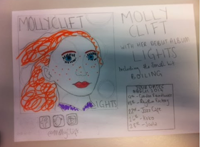
Here is the advert that I made in the lesson today (don't judge the drawing, I don't do art). I had some reviews below the album cover and then the tour dates beside them and then Rebecca told me it has to be one or the other so I got rid of the magazine reviews and put down social network icons there instead. As far as the colours I'll use for the advert background, I'm not sure what I'll use as of yet, but I'll be using the same font as the album cover and the same font colour.

No comments:
Post a Comment